
Looking for an Expert Financial Consultant?
Maecenas sed diam eget risus varius blandit sit amet non magna magnis dis parturient
- Free Call: +1-222-333-44444
Your website might have stunning visuals, valuable content, and a fast loading speed, but if it lacks strong CTAs (Calls-to-Action), you’re likely missing out on real results.
Thank you for reading this post, don't forget to subscribe!At X International, we’ve seen how powerful a well-placed, well-written CTA can be. In fact, businesses can increase conversions by up to 3x or more simply by optimizing their CTAs.
In this blog, we’ll break down what makes a CTA effective, where to place it, and how you can guide users to take action.
A CTA is a prompt that tells your visitors what you want them to do next. It’s usually a button, link, or phrase that moves the user closer to your business goal, whether that’s filling out a form, booking a call, signing up for a newsletter, or making a purchase.

Many websites fail to convert not because of design or traffic, but because their CTAs are:
When users are unsure of what to do next, they often do nothing.
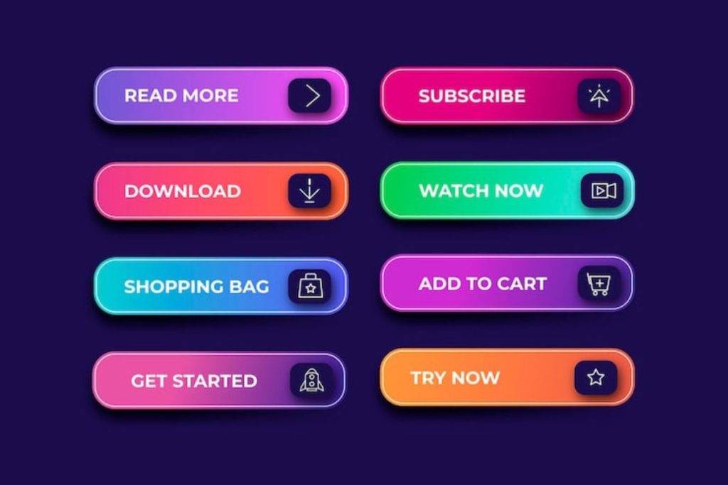
Here are the elements of a high-converting CTA:
Avoid vague phrases. Be specific about the action and outcome.
Examples:
Start with strong verbs like:
These trigger a sense of urgency and direction.
A CTA should grab attention — but not annoy.
Your CTA should appear:
Rule of thumb: Every page should have at least one clear CTA.
We’ve helped businesses double and even triple their website conversions with just a few CTA improvements. For example:
Before: “Submit” button on a contact form — low engagement.
After: Changed to “Get Your Free Quote in 24 Hours” — resulted in 3x more form submissions in the first month.
If you’re in the website services industry (like X International), here are some proven CTA examples:
Each of these is clear, benefit-driven, and user-focused.
CTAs may seem like small parts of your website, but they hold massive influence over user behavior. A well-placed, well-written CTA can be the difference between a bouncing visitor and a paying customer.
At X International, we specialize in designing websites that don’t just look good, they perform. That means every CTA we create is built with conversion in mind.
Maecenas sed diam eget risus varius blandit sit amet non magna magnis dis parturient