
Looking for an Expert Financial Consultant?
Maecenas sed diam eget risus varius blandit sit amet non magna magnis dis parturient
- Free Call: +1-222-333-44444
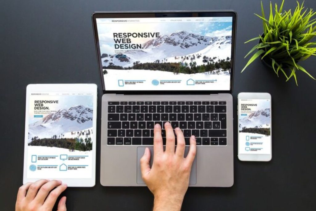
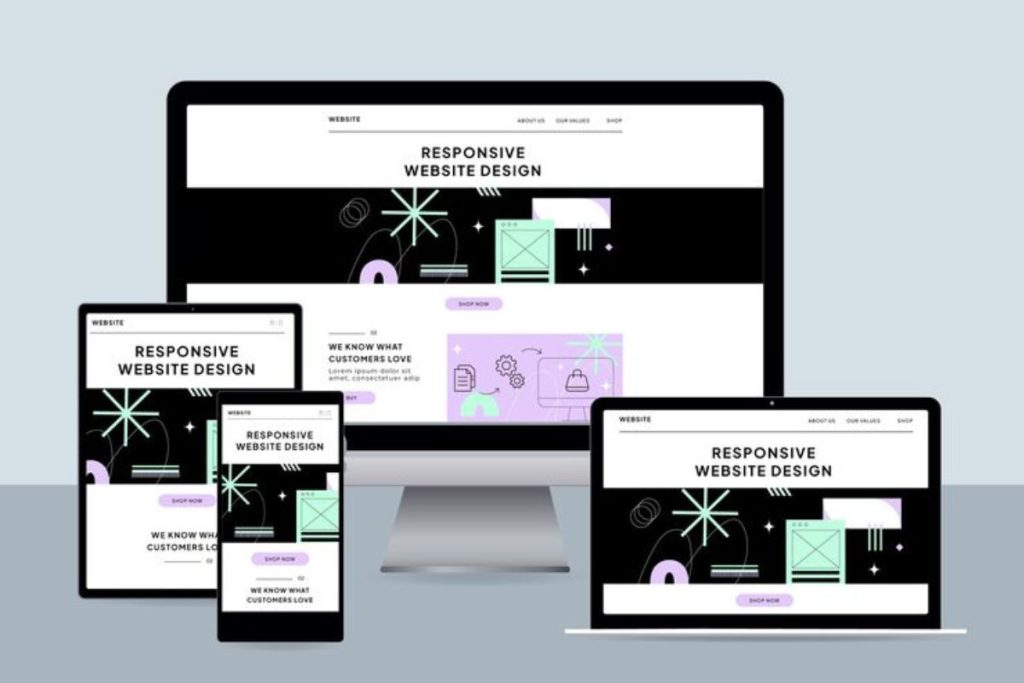
The way people browse online has completely changed. Some users open websites on high-resolution desktop screens, while others rely on tablets or smartphones. If your site isn’t designed to adjust to these differences, chances are you’ll lose visitors before they even see your products or services.
Thank you for reading this post, don't forget to subscribe!That’s why responsive web design has become a must-have. Instead of creating multiple versions of your website, a responsive design adapts automatically to every screen size. In today’s competitive online market, responsive design isn’t a luxury, it’s the standard for professional websites.
If your website doesn’t work well on smaller screens, you’re missing out on a majority of potential customers.
First impressions matter. A clean, responsive design ensures users can easily browse, read, and shop. A better experience increases the chances they’ll stay longer and take action.
With responsive web design, your site is more likely to rank higher, attract organic traffic, and reduce bounce rates.
Instead of building and maintaining separate sites for desktop and mobile, a responsive design gives you one site that works everywhere. That means lower maintenance costs and easier updates.
With new phones, tablets, and screen sizes constantly being introduced, responsive web design ensures your site stays compatible without needing a full redesign every year.
Every responsive website is built on a few essential principles:
If you’re planning to upgrade or launch a new site, here’s how to make it responsive:
Traditional websites were built with fixed layouts. They looked fine on desktops but failed on smaller screens, often forcing businesses to build a separate “mobile site.”
With responsive web design, you only need one website that automatically adjusts itself. This approach not only saves time and money but also creates a consistent user experience across all devices.
A responsive website does more than just look good. It brings real business value:
Your website is your business’s digital storefront. If it doesn’t deliver a seamless experience across devices, you risk losing customers to competitors who do. Investing in responsive web design ensures that your site is future-proof, easy to use, and optimized for growth.
At X International, we design responsive websites that combine beauty with functionality. Whether you’re starting a new business website, launching an e-commerce store, or upgrading an outdated design, our team can help you create a site that performs everywhere.
Ready to upgrade your online presence? Let’s build your responsive website today!
Maecenas sed diam eget risus varius blandit sit amet non magna magnis dis parturient