
Looking for an Expert Financial Consultant?
Maecenas sed diam eget risus varius blandit sit amet non magna magnis dis parturient
- Free Call: +1-222-333-44444
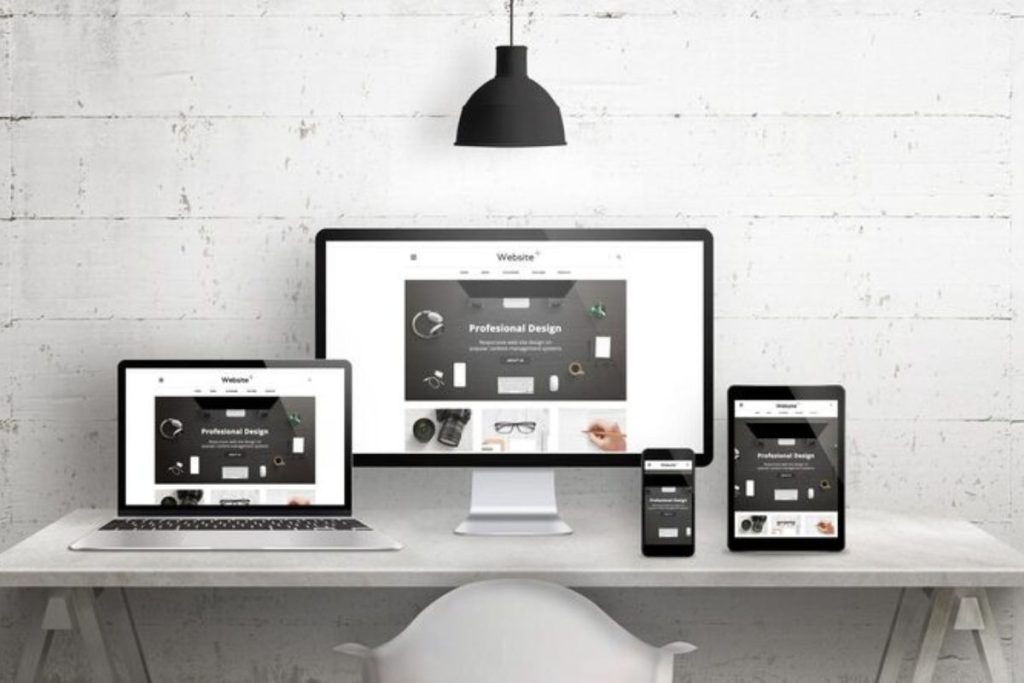
In today’s fast-paced digital world, users don’t wait. They browse, scroll, and shop on the go. And in 2025, mobile-first web design is no longer a trend, it’s a necessity.
Thank you for reading this post, don't forget to subscribe!At X International, we’ve seen firsthand how businesses that prioritize mobile usability experience better engagement, stronger SEO rankings, and higher conversion rates. In this article, we’ll explain why mobile-first web design matters, and how it directly impacts your search visibility, user experience, and sales.
Mobile-first design is a development approach where the website is designed for mobile devices first, and then scaled up for tablets and desktops. This ensures the site looks and functions perfectly on the smallest screens before adapting to larger ones.
Why does this matter? Because more than 70% of internet traffic in 2025 comes from smartphones.
Google now uses mobile-first indexing, which means it primarily looks at the mobile version of your website when deciding how to rank it in search results.
If your mobile site is:
Key ranking factors tied to mobile:
A poor mobile experience = poor SEO performance.
Imagine this: A user taps your ad, lands on your site, and can’t read the text or find the menu. Within 5 seconds, they’re gone, and they probably won’t come back.
A mobile-first website ensures:
Users expect fast, intuitive, and seamless mobile browsing. If they don’t get it, they’ll move on, likely to a competitor who does it better.
Here’s the business case: A website that’s not optimized for mobile leaves money on the table.
Why?
On the other hand, a mobile-first website:
One of our clients saw a 38% increase in mobile conversions just by switching to a mobile-first design with X International.

The future of browsing is mobile-first, and even moving toward mobile-only in some sectors. Designing for mobile now means your site will stay relevant, functional, and adaptable for years to come.
We build mobile-first websites that:
At X International, mobile usability isn’t an afterthought — it’s the foundation. Our process includes:
Whether it’s a landing page, service site, or eCommerce platform — we build it mobile-first, every time.
In 2025, mobile-first design is no longer optional.
It’s how you:
If your current website isn’t delivering a great mobile experience, you’re already falling behind. But the good news is: we can help you catch up, fast.
Let’s Talk About Your Mobile Experience
Book a free consultation with X International today and let’s make sure your website is ready for the mobile-driven future.
Maecenas sed diam eget risus varius blandit sit amet non magna magnis dis parturient